Jetpack Compose Hands-On
The jetpack compose is becoming the new way of design. So there is a new learning curve that android developers will be going through. To get a gist about composable and the setup, please check the following links —
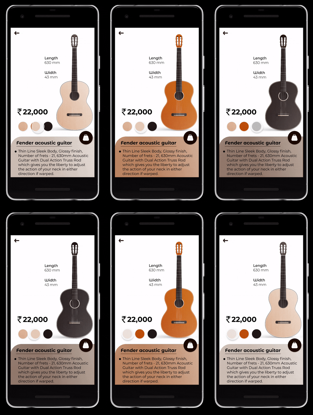
I will be sharing how to design the following design in Jetpack compose.

Following are the assets —
Guitars — light_guitar, orange_guitar, dark_guitar
Colours Variants — color_light, color_orange, color_dark
So lets start with Guitar image
Image(
    painter = painterResource(id = R.drawable.guitar_light),
    contentDescription = "Light Guitar",
    modifier = Modifier
        .height(512.dp)
        .width(220.dp)
        .animateContentSize(),
    contentScale = ContentScale.Fit
)
And we have 3 guitar images of same size. So we can reuse the same compose. By passing id of resource, we can inflate what guitar we want.
@Composable
fun Guitar(id: Int) {
    Image(
        painter = painterResource(id = id),
        contentDescription = "Light Guitar",
        modifier = Modifier
            .height(512.dp)
            .width(220.dp)
            .animateContentSize(),
        contentScale = ContentScale.Fit
    )
}
The dimensions can also be created with a common composable. Since both have two similar designs Text is arranged vertically.
@Composable
fun DimensionText(dimenProp: String, dimenValue: String) {
    Column() {
        Text(
            dimenProp,
            fontSize = 18.sp,
            fontWeight = FontWeight.Medium,
            modifier = Modifier.padding(horizontal = 8.dp)
        )
        Text(
            dimenValue,
            fontSize = 18.sp,
            fontWeight = FontWeight.Normal,
            modifier = Modifier.padding(horizontal = 8.dp)
        )
    }
}
Now adding the other cost text, color variants
Text(
  "Rs 22,000",
  fontWeight = FontWeight.Black,
  fontSize = 24.sp,
  letterSpacing = 2.sp
)

Row() {
    Image(
        painter = painterResource(id=R.drawable.guitar_light_color),
        contentDescription = "light color",
        modifier = Modifier.size(58.dp).clickable { }
    )
    Image(
        painter =painterResource(id=R.drawable.guitar_orange_color),
        contentDescription = "orange color",
        modifier = Modifier.size(58.dp).clickable { }
    )
    Image(
        painter = painterResource(id =R.drawable.guitar_dark_color),
        contentDescription = "dark color",
        modifier = Modifier.size(58.dp).clickable { }
    )
}
Since the image is repeating we can optimise it as by creating a common composable
@Composable
fun ColorVariant(id: Int, desc: String, callback: () -> Unit) {
    Image(
        painter = painterResource(id = id),
        contentDescription = desc,
        modifier = Modifier
            .size(58.dp)
            .clickable { callback() }
    )
}
Now, we will add elements which are there in bottom part of screen.
First we will create a BulletText composable method
@Composable
fun BulletText(textDetails: String) {
    Row(modifier = Modifier.padding(horizontal = 24.dp, vertical = 4.dp)) {
        Text(
            "●",
            fontSize = 8.sp,
            modifier = Modifier.padding(end = 8.dp, top = 6.dp)
        )
        Text(
            textDetails,
            fontSize = 16.sp
        )
    }
}
Second, we will use the method in column
Column() {
    Text(
        "Fender acoustic guitar",
        fontSize = 28.sp,
        fontWeight = FontWeight.SemiBold,
        modifier = Modifier.padding(horizontal = 30.dp, vertical = 16.dp),
        textDecoration = TextDecoration.Underline
    )    BulletText("Thin Line Sleek Body, ....")    BulletText("Included components: Aco...")    BulletText("Linden binding and full wood...")
}
Now the last view is floating action button
FloatingActionButton(
    onClick = { }, modifier = Modifier
        .size(56.dp), backgroundColor = Color.Black
) {
    Icon(
        imageVector = Icons.Filled.Work,
        contentDescription = "buy",
        modifier = Modifier.background(color = Color.Transparent),
        tint = Color.White
    )
}
Icons are from
androidx.compose.material.icons— For this use the material icon dependencyimplementation “androidx.compose.material:material-icons-extended:$compose_version”
Now we will align all the views, we will use Box as our root and constraint layout as our base layout for top section and combination of box and column to make other required alignments.
Box(
    modifier = Modifier
        .fillMaxSize()
        .background(color = Color.White)
) {
    Column(
        modifier = Modifier
            .fillMaxSize()
            .verticalScroll(rememberScrollState())
    ) {
        ConstraintLayout(
            modifier = Modifier
                .fillMaxWidth()
        ) {
        }
        Box(
            modifier = Modifier
                .fillMaxWidth()
        ) {
        }
    }
    Icon(
        imageVector = Icons.Rounded.ArrowBack,
        contentDescription = "back",
        modifier = Modifier
            .padding(top = 20.dp, start = 16.dp)
            .clickable {
                Log.d("Icon Tapped", "onBackClicked")
            }
            .padding(8.dp)
    )
}
Now we need to align them properly.
Top section using constraint layout, this is the first child of Column()
ConstraintLayout(
    modifier = Modifier
        .fillMaxWidth()
) {
    //This is how we create references to any view in jetpack compose to use the constraints
    val (image, dimension1, dimension2, price, colorRow, bottomCard) = createRefs()

    //usage of constraint chaining
    createVerticalChain(dimension1, dimension2, chainStyle = ChainStyle.Packed(0.4f))

    Column(
        modifier = Modifier.constrainAs(image) {
            end.linkTo(parent.end)
            top.linkTo(parent.top)
        }
    ) {
        when (selectedColor.value) {
            0 -> {
                AnimatedVisibility(
                  visible = selectedColor.value == 0) {
                    Guitar(id = resoureList[0])
                }
            }
            1 -> {
                AnimatedVisibility(
                  visible = selectedColor.value == 1) {
                    Guitar(id = resoureList[1])
                }
            }
            2 -> {
                AnimatedVisibility(
                  visible = selectedColor.value == 2) {
                    Guitar(id = resoureList[2])
                }
            }
        }
    }
    DimensionText(
        modifier = Modifier
            .padding(end = 50.dp)
            .constrainAs(dimension1) {
                centerHorizontallyTo(parent)
                top.linkTo(parent.top)
            },
        dimenProp = "Length",
        dimenValue = "630mm"
    )

    DimensionText(
        modifier = Modifier
            .padding(top = 40.dp)
            .constrainAs(dimension2) {
                top.linkTo(dimension1.bottom)
                start.linkTo(dimension1.start)
                bottom.linkTo(image.bottom)
            },
        dimenProp = "Width",
        dimenValue = "43 mm"
    )

    Text("Rs 22,000", modifier = Modifier.constrainAs(price) {
        start.linkTo(parent.start, margin = 20.dp)
        bottom.linkTo(colorRow.top, margin = 20.dp)

    }, fontWeight = FontWeight.Black, fontSize = 24.sp, letterSpacing = 2.sp)

    Row(modifier = Modifier.constrainAs(colorRow) {
        start.linkTo(price.start)
        bottom.linkTo(image.bottom)
    }) {
        ColorVariant(
            R.drawable.guitar_light_color,
            desc = "light color"
        ) { changeColor(0) }

        ColorVariant(
            R.drawable.guitar_orange_color,
            desc = "oragne color"
        ) { changeColor(1) }

        ColorVariant(
            R.drawable.guitar_dark_color,
            desc = "dark color"
        ) { changeColor(2) }
    }
}
Here the method changeColor(value: Int) , and property selectedColor is used to control the dynamic change of resource as per user selection. Check the git repo for full source code.
Now we need to create the bottom design. We see its curved at the top start corner, and has an item overlying the border. For this we will create Box() inside Box() and then in inner box scope we will add background as per design and a padding so that there is space for the floating button.
Box(
    modifier = Modifier
        .fillMaxWidth()
) {
    Box(
        modifier = Modifier
            .fillMaxHeight()
            .padding(
                top = 28.dp,
            )
            .background(
                color = Color(if (selectedColor.value == 0) 0xFFE7B99A else if (selectedColor.value == 1) 0xFFD45200 else 0xFF221716).copy(
                    alpha = 0.75F
                ),
                shape = RoundedCornerShape(
                    topStart = 60.dp,
                    bottomStart = 60.dp
                )
            )
            .background(
                brush = Brush.horizontalGradient(
                    colors = listOf(
                        Color(0xFF9F9F9F).copy(alpha = 0.70F),
                        Color(
                            0xFFFFFFFF
                        ).copy(alpha = 0.50F),
                        Color(
                            0xFFFFFFFF
                        ).copy(alpha = 1.0F),
                    ),
                ),
                shape = RoundedCornerShape(
                    topStart = 60.dp,
                    bottomStart = 60.dp
                )
            )
            .padding(
                bottom = 28.dp
            )
            .align(Alignment.BottomCenter)
    ) {
        Column() {
            Text(
                "Fender acoustic guitar",
                fontSize = 28.sp,
                fontWeight = FontWeight.SemiBold,
                modifier = Modifier.padding(horizontal = 30.dp, vertical = 16.dp),
                textDecoration = TextDecoration.Underline
            )
            BulletText("Thin Line Sleek Body, Glossy finish, Number of frets - 21, 630mm Acoustic Guitar with Dual Action Truss Rod which gives you the liberty to adjust the action of your neck in either direction if warped.")
            BulletText("Included components: Acoustic Guitar with strap, Bag, Strings and 2 Picks")
            BulletText("Linden binding and full wood construction with geared tuning, wood frame and steel strings")
        }

    }

    FloatingActionButton(
        onClick = { }, modifier = Modifier
            .padding(end = 16.dp)
            .size(56.dp)
            .align(Alignment.TopEnd), backgroundColor = Color.Black
    ) {
        Icon(
            imageVector = Icons.Filled.Work,
            contentDescription = "buy",
            modifier = Modifier.background(color = Color.Transparent),
            tint = Color.White
        )
    }
}
And thats the end of it. I have also added scrolling gesture in column. Checkout the git repo for the source code. https://github.com/samG4/JetpackComposeSamples
Thank you for reading.

